Kuriyama Mexico Website Redesign
Kuriyama Mexico, part of the global Kuriyama of America organization, approached us to design and develop a new website. The primary goal was to decrease their high bounce rate of 76% while increasing sessions and user engagement.
They wanted a user-friendly, optimized site that met the global brand’s visual guidelines and showcased their extensive product catalog. Additionally, the website needed to meet Google’s Core Web Vitals standards to improve search engine rankings and overall performance.
Visit their Website
Tools
Figma
WordPress
Elementor
HTML
CSS
JS
Year
2021
TL;DR
What this case study is about
Business Objectives
- Reduce avg. bounce rate
- Leverage the US website catalog database
- Visual design that sets MX apart from US
Constraints
- Website had to launch in 6 weeks
- Adhere to global brand guidelines
- Many stakeholders across MX and US
My Role
- Web design
- Use Elementor and WordPress to develop a live website
- Create a custom widget for catalog search across multiple URLs
Results
- Avg. bounce rate reduced from 76.3% to 38.43%
- Sessions increased by 200%
- Users increased by 143%
Discovery
Using Google Analytics to better understand user behavior
Visual exploration
Incorporating feedback from two different stakeholder visions
What I did:
- Created multiple design iterations
- Collaborated with US and MX leadership to incorporate their design visions
- Created high-fidelity designs
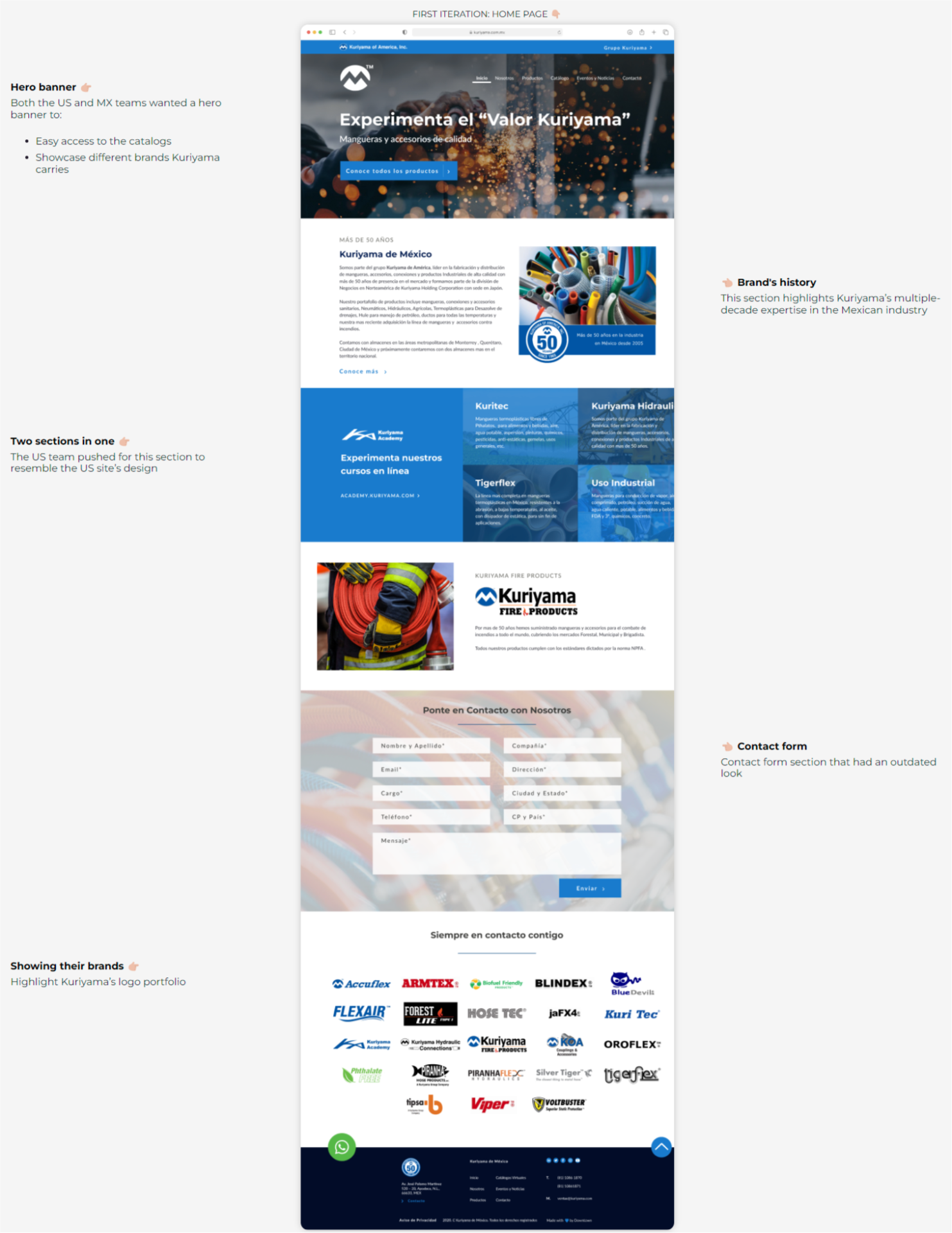
Both the US and MX teams wanted a hero banner to:
- Easy access to the catalogs
- Showcase different brands Kuriyama carries
The US team pushed for this section to resemble the US site’s design
Highlight Kuriyama’s logo portfolio

This section highlights Kuriyama’s multiple-decade expertise in the Mexican industry
Contact form section that had an outdated look

Design Iterations
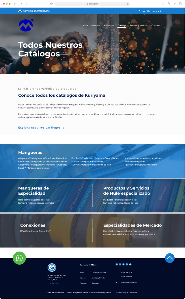
First pass to validate some concepts
What was lacking...
- Initial design focused on creating an index page with clustered catalog sections
- No functionality to allow users to search the catalog library
- Catalog covers were not scannable

Design feedback from stakeholders
Aligning different design perspectives from the MX and US teams
Facilitated consensus by articulating the rationale behind design choices, ensuring a shared understanding of the website’s look and feel.
Presented blended design options that fostered collaboration between the US and Mexico teams.
Led meetings to bridge the gap between the US team’s traditional perspective and the Mexico team’s desire for a modern aesthetic.
Final Design
Simplifying multiple sections and adding a search bar feature
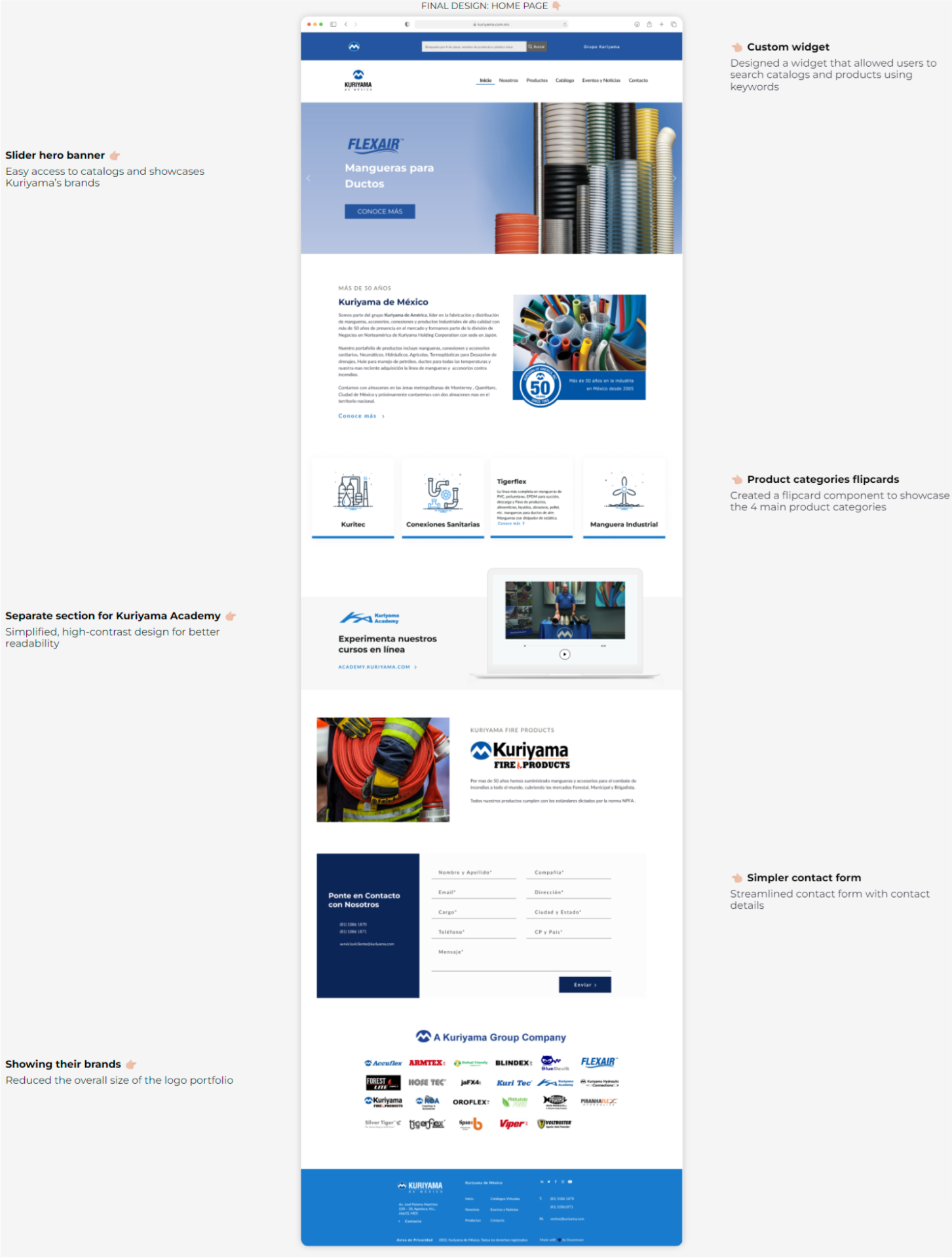
The final design iteration focused on enhancing the user experience by making it easier for visitors to find products and catalogs right from the start. Sections were also simplified to enhance readability.
What I did:
- Reduced the amount of text overall to lower the cognitive load on users
- Simplified the contact form and downsized the logo portfolio section
- Created representative icons to simplify the products category
Easy access to catalogs and showcases Kuriyama’s brands
Simplified, high-contrast design for better readability
Reduced the overall size of the logo portfolio

Designed a widget that allowed users to search catalogs and products using keywords
Created a flipcard component to showcase the 4 main product categories
Streamlined contact form with contact details

Final Design
Making the catalog page easier to find
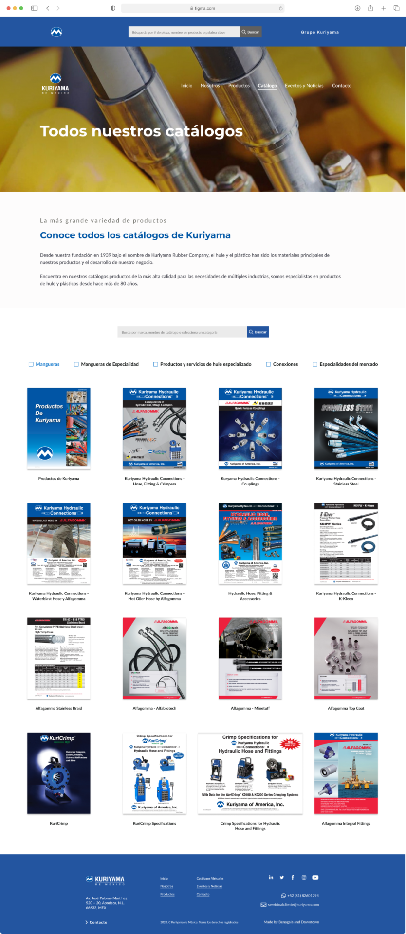
In the final design of the catalog page, I developed a new interface that simplified the process for users to easily find and filter catalogs, improving overall navigation and accessibility.
What's new:
- A grid layout was used to display the covers of all available catalogs
- Search bar and checkboxes were added to filter catalogs by category
- A pagination system was suggested to make it easier for users to navigate


Custom Widget
Creating a custom search bar that pulls data from the US website
I developed a custom search bar. This bar enables users to easily find products using part numbers, names, SKUs, or keywords, improving navigation and making product discovery more efficient.
What I did:
- Used JavaScript to create a script to open a new tab, input a custom URL, and add the user’s query to the URL string
- The URL string was then sent to the US product database, which searched for relevant results based on the user’s query
- A results page was generated, displaying all products related to the user’s search query
Results
Increasing engagement, improving the search ranking, and enhancing the experience
- Reduced the avg. bounce rate from 76.3% to 38.43%
- The number of sessions increased by 200%
- Number of users increased by 143
- The Core Web Vitals metrics for the website were CLS of 932ms, TBT of 9ms, and LCP of 0
Conclusion
Different design visions can co-exist
I facilitated conversations among agency, US, and MX teams to explain the design direction and its benefits for the project’s objectives.
Learning is crucial for every project
I expanded my web development skills through creating custom components that required exploring new techniques in HTML, CSS, and JavaScript.
Make time for design refinement
I should have advocated for more time to experimenting and prototyping. I had to start with high-fidelity designs due to time constraints and client preferences, limiting my ability to prototype the designs.