Character Stats Progression Redesign
A sci-fi side-scroller looter shooter in which players play as super-soldiers. Chimera Custom XG features a stats progression system that allows players to enhance their super-soldier’s health, agility, strength, genetic powers, and more with every level they gain.
The team felt the legacy system required a redesign that addressed what players wanted to see in-game.
Tools
Figma
After Effects
FigJam
Otter.ai
Year
2023 for Version 1.0
2025 for Version 2.0
My impact
I led the redesign effort for the player stats screen, conducted playtests to understand and integrate players’ feedback into the design process, and collaborated with engineering partners to implement the new design inside Unity.
Version 1.0
Shipped with the game’s demo in June 2024.
Version 2.0
Launched with the game’s release to Early Access in March 2025.
TL;DR
What this case study is about
Business Objectives
- Understand if the legacy system met players’ expectations
- Streamline information delivery for a complex system
Constraints
- No budget for recruiting participants
- Limited buy-in for interviews from leadership
- Testing limited to internal team
My Role
- UX/UI design
- Recruiting users and conducting interviews
- Creating designs and prototypes in Figma
- Collaborating with Engineering to implement design in Unity
Results
- New character stats system UI
- Expanded design system
- V2.0 of the new experience shipped in March 2025
Discovery
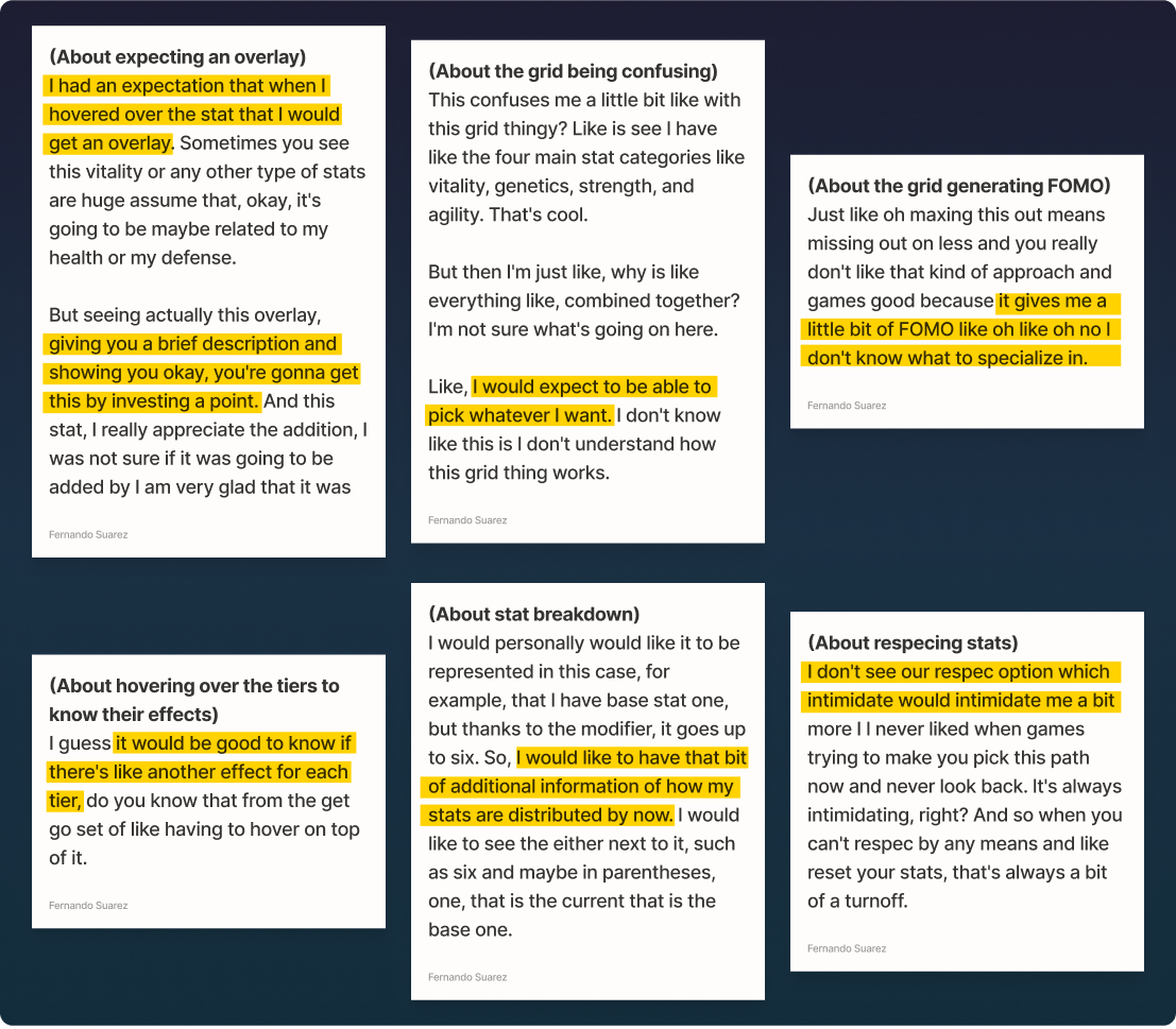
Understanding what players want
I conducted 5 guerrilla interviews to uncover the following issues with the stats progression UI:
- Players wanted additional information about their stats, such as their character’s base stats.
- Expectation to see a brief description of a stat and show the effects of investing a point.
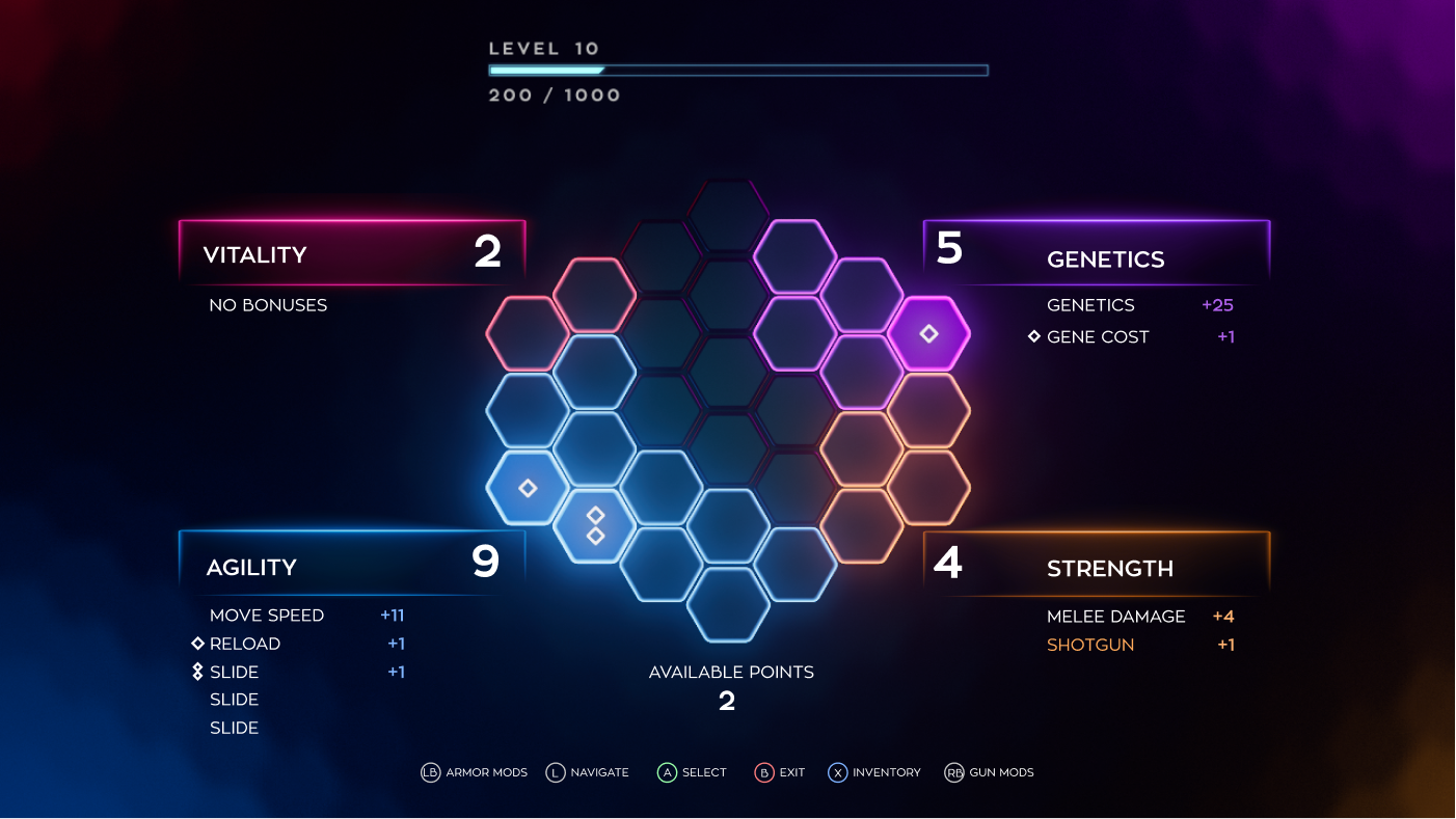
- The hexagon grid design was confusing, and players were unsure how it worked.
- The legacy grid design generated FOMO (Fear of missing out) when adding points to the different stats.
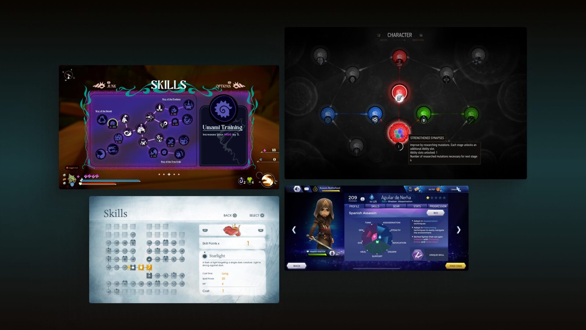
Initial concepts to test
What about the concepts work for players?
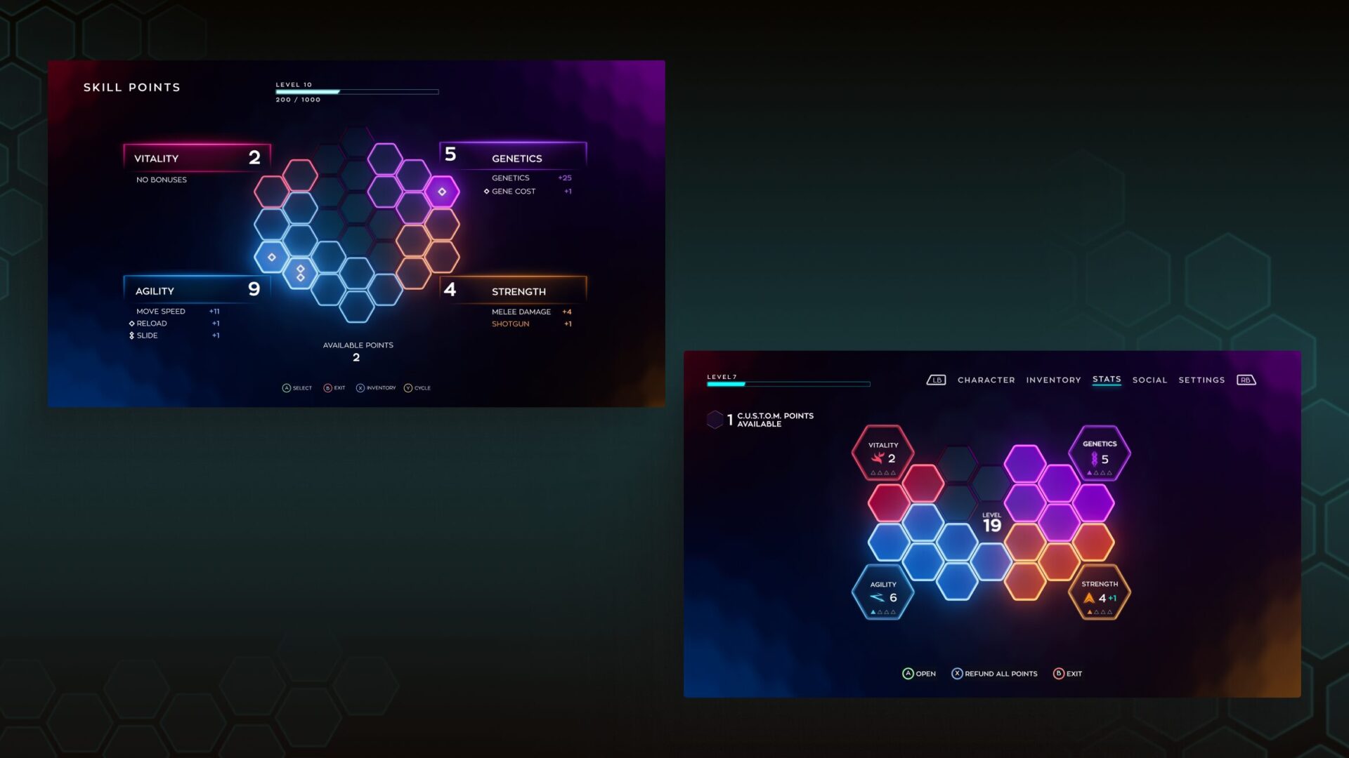
I took the existing UI, rearranged the layout, and added extra information, like the 4 milestones available for each stat. Not showing what was unlockable could confuse players about where to allocate points. I used 2 concepts to test with players.
Concept validation
Testing the initial concepts
I took the initial concepts and conducted 3 quick concept validation interviews to determine which direction to pursue in further iterations. I uncovered the following:
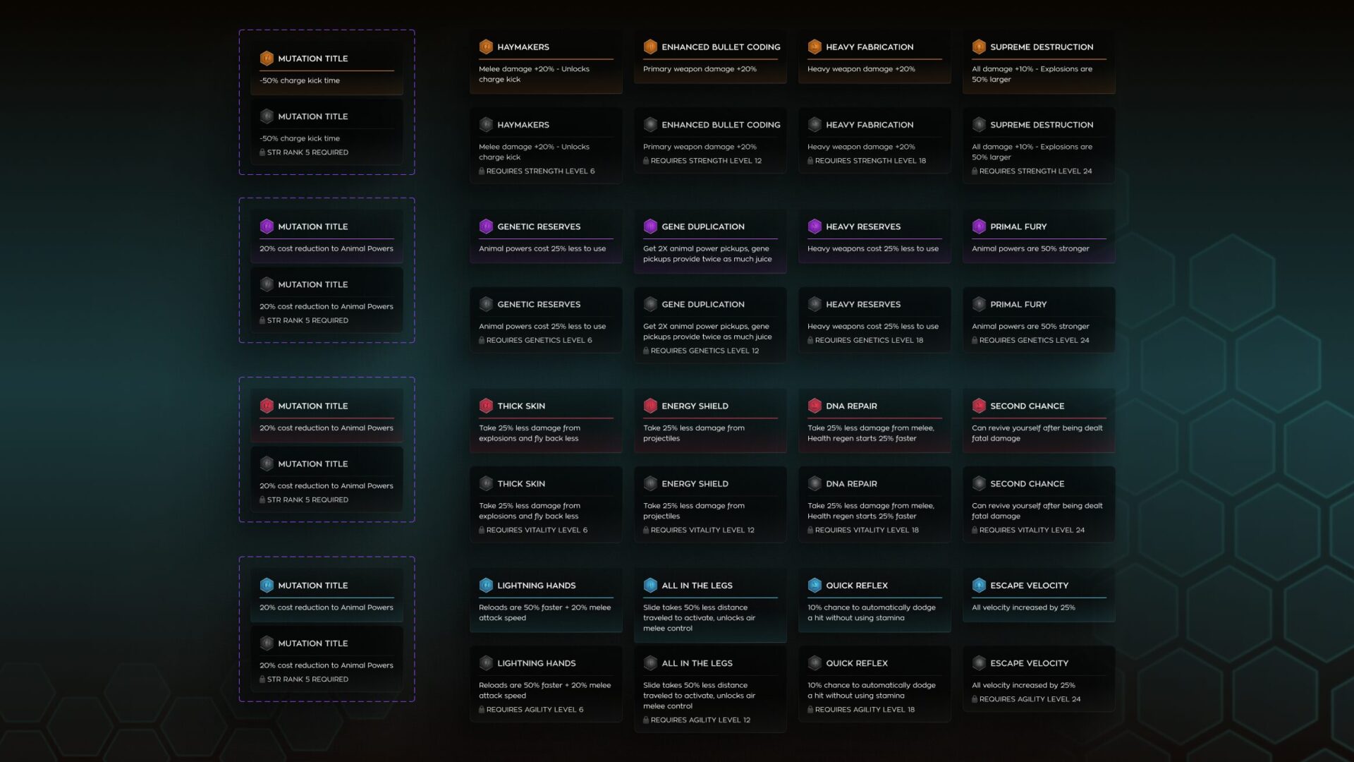
- Milestone icon design was easier to understand as something that can be unlocked.
- Players wanted overlays when hovering over UI items to get additional information on their stats.
- The diamond shapes within the hexagons were confusing as to what they meant.
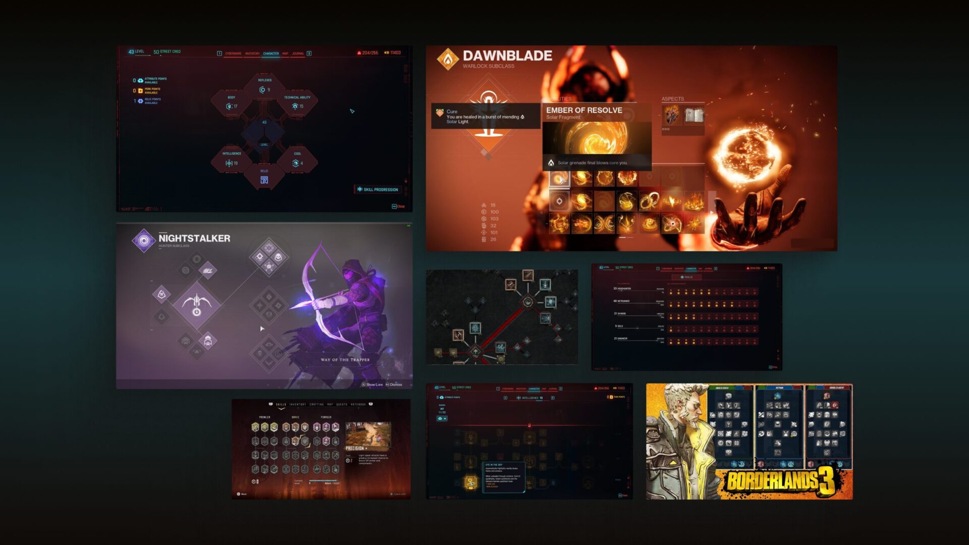
Visual Inspiration
Design Iterations
New experience
The new design directly addresses pain points by making the player’s soldier information available on-screen, adding hover overlays for the potential unlockables, detaching the hexagon grid from being associated with a specific stat, and introducing a new aesthetic for the progression screen.
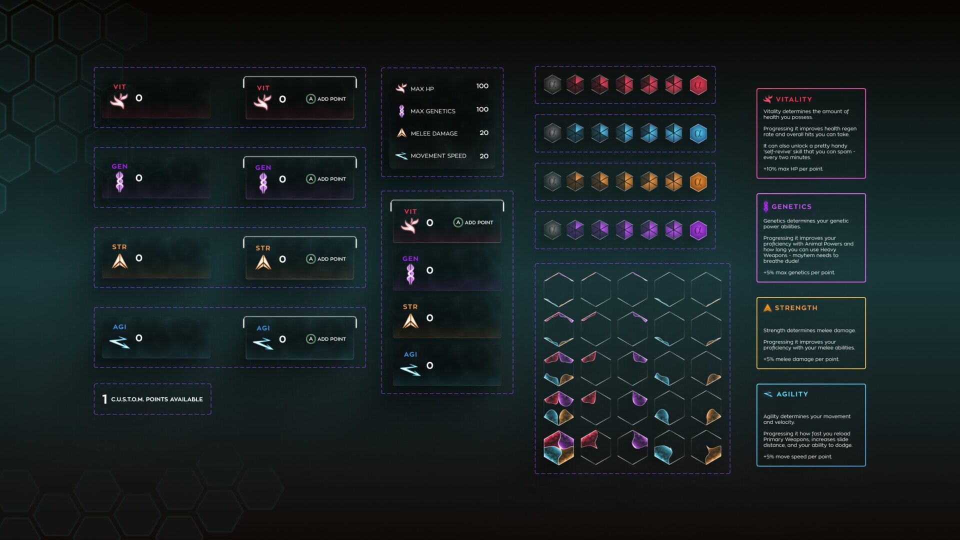
Main Stat Screen
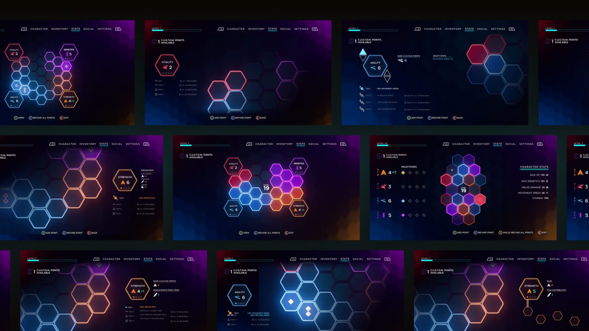
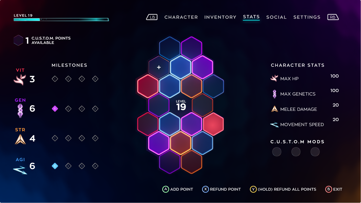
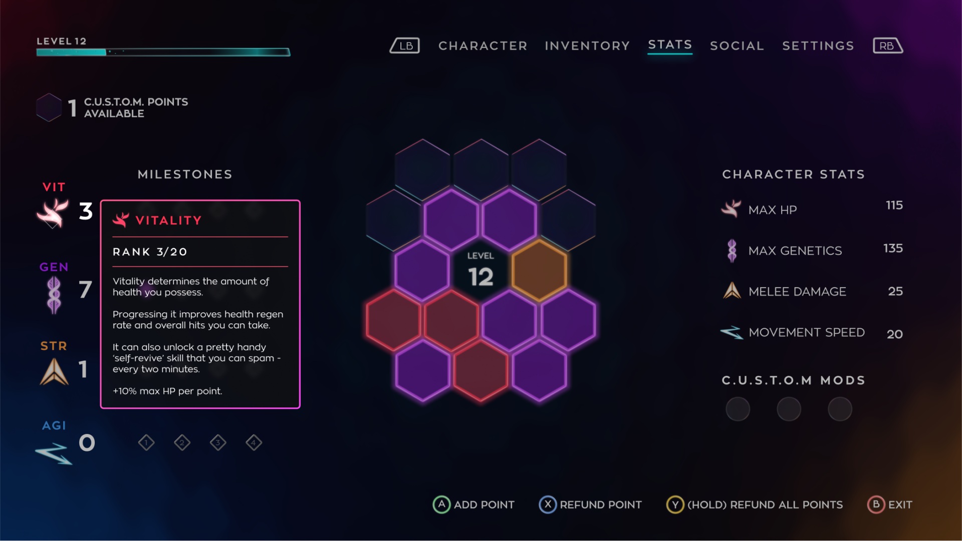
Interviews with players revealed the need to see basic information on their character’s stats. The new design adds the base value for each stat and what it represents.
Information Overlays
The stats system is complex; interviews revealed that players wanted to know what they could unlock and what investing in each point would entail.
The new design leverages overlays when a player hovers over specific elements on the screen, revealing information only when the player wants to see it.

Adding Points
Conversations with players revealed the regions in hexagon grid space were being associated with a specific stat.
The new design allows players to add any stat point to any of the hexagons, allowing them to customize their DNA as they please without feeling locked into a specific grid section.

Grid Growth
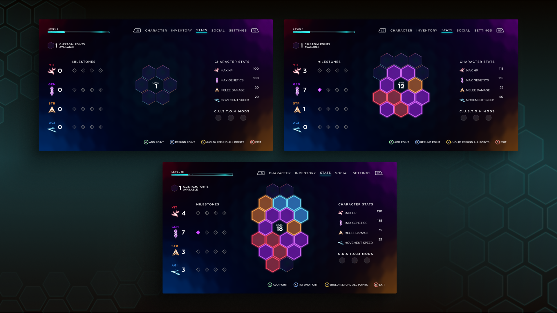
Diving more into the DNA and chemistry theme and considering the feedback of wanting to see “your DNA grow,” the new design shows the growth players will achieve at key levels.
By having the hexagon grid grow at different stages, we show the player the impact they’ve made by investing points into their soldier’s stats.
Internal Testing / QA
The QA team at Volok engaged with the new design prototype and liked it. Their comments helped me identify two areas for improvement after the game’s demo launch:
- The bonus stat points that weapons and armor provide are still unclear regarding how they affect your overall stats.
- Color-dense screens may not translate well to colorblind profiles.
The new UI experience was handed off to the UI engineer for implementation to meet the demo release deadline.
Evolving to 2.0
A few months after the implementation of version 1.0, the creative direction for the game changed—the 1.0 version of this stats system allowed for a max of 20 player levels.
After level 20, there was no progression or scaling of the players’ powers or abilities. A few weeks before launch, leadership came to me with the challenge to flip this system to allow for scaling beyond level 20 while keeping the same unlockables so we could meet the release date.
Additionally, I had to reuse most of the components that had already been designed to avoid extra dev time and scope creep.
Visual Inspiration 2.0
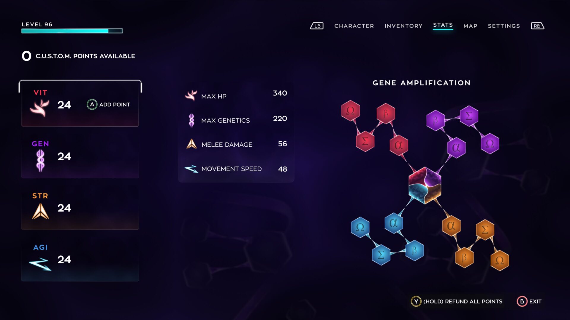
New progression flow, now up to 96 player levels
The new flow would allow players to get up to level 96, while I reused the same amount of unlockables. Here is how it worked:
- A bigger hexagon in the center that represents the mixing of the 4 main stats of the player
- One strand per stat, each strand made up of 6 hexagons
- Each hexagon in a strand is split into 6 pieces. Every level gained, a player could allocate a point to fill a piece of the hexagon
- Once a hexagon in a strand is filled – 6 pieces, the player unlocks the amplification associated with that hexagon
- Rinse a repeat
To get the best amplifications (unlockables), players would need to fill the entire strand. The idea was to encourage playtime by showing that grinding would unlock powerful skill upgrades.

Main Screen 2.0
For version 2.0, I designed:
- New stat selector – 4 on the left side of the screen for easy point addition
- Keep the stats numbers in the middle
- DNA strand hexagons that would live on the right third of the screen
Component Redesign
Recommendations
- Conduct more 1:1 playtest sessions on the new system to get more feedback
- Co-design with the players, bringing them in early into the design process, will help create experiences players want
- Think how the new UI design fits into localization for languages like Portuguese and Spanish
Conclusion
I enjoyed deep-diving into such a complex progression system. Redesigning this UI became a learning experience as I applied my UX skillset to micro-interactions, discoverability, and feedback mechanisms. Most importantly, it helped me better understand that information delivery must happen when a player wants it and must be easy to find. Overloading players results in a turn-off for playing the game.