E-Commerce design for retailer
Chiquihuite MX is a Mexican startup that supports local producers and promotes fair trade with products such as vegan snacks, organic drinks, and handcrafted goods.
When the pandemic hit, they needed an e-commerce platform to adapt to lockdowns and keep their business running. As the lead designer, I developed a user-friendly website that enabled them to pivot to online sales and continue supporting their mission.
Tools
Figma
WordPress
Elementor
HTML
CSS
Year
2020
TL;DR
What this case study is about
Business Objectives
- Transition to online sales to sustain business during pandemic lockdowns
- Increase brand visibility by reaching a broader digital audience
Constraints
- Tight timeline to launch the e-commerce platform before lockdowns intensified
- Minimal existing digital presence
My Role
- Led web design and development for the e-commerce platform
- Ensured full functionality through hands-on development
- Trained the staff to use the e-commerce platform
Results
- Successfully launched the e-commerce platform, enabling online sales and expanding customer reach
Discovery
Secondary research to guide design
I interviewed the startup’s leadership to understand their needs and focused on understanding the target audience’s needs through secondary research.
With the onset of pandemic lockdowns preventing direct customer interviews, I analyzed competitor e-commerce platforms. This research helped me identify essential features that would guide my design decisions while staying true to the brand’s mission.
Visual exploration
Quick design to meet a tight schedule
During the e-commerce project, the team and I faced a tight deadline for launching the website, making time management critical. To streamline the process, I ran a quick visual exploration phase to stay on track.
What I did:
- Two design iterations to ensure there was enough time for development
- Aligned the website’s look and feel to the brand’s guidelines
- High-fidelity wireframes
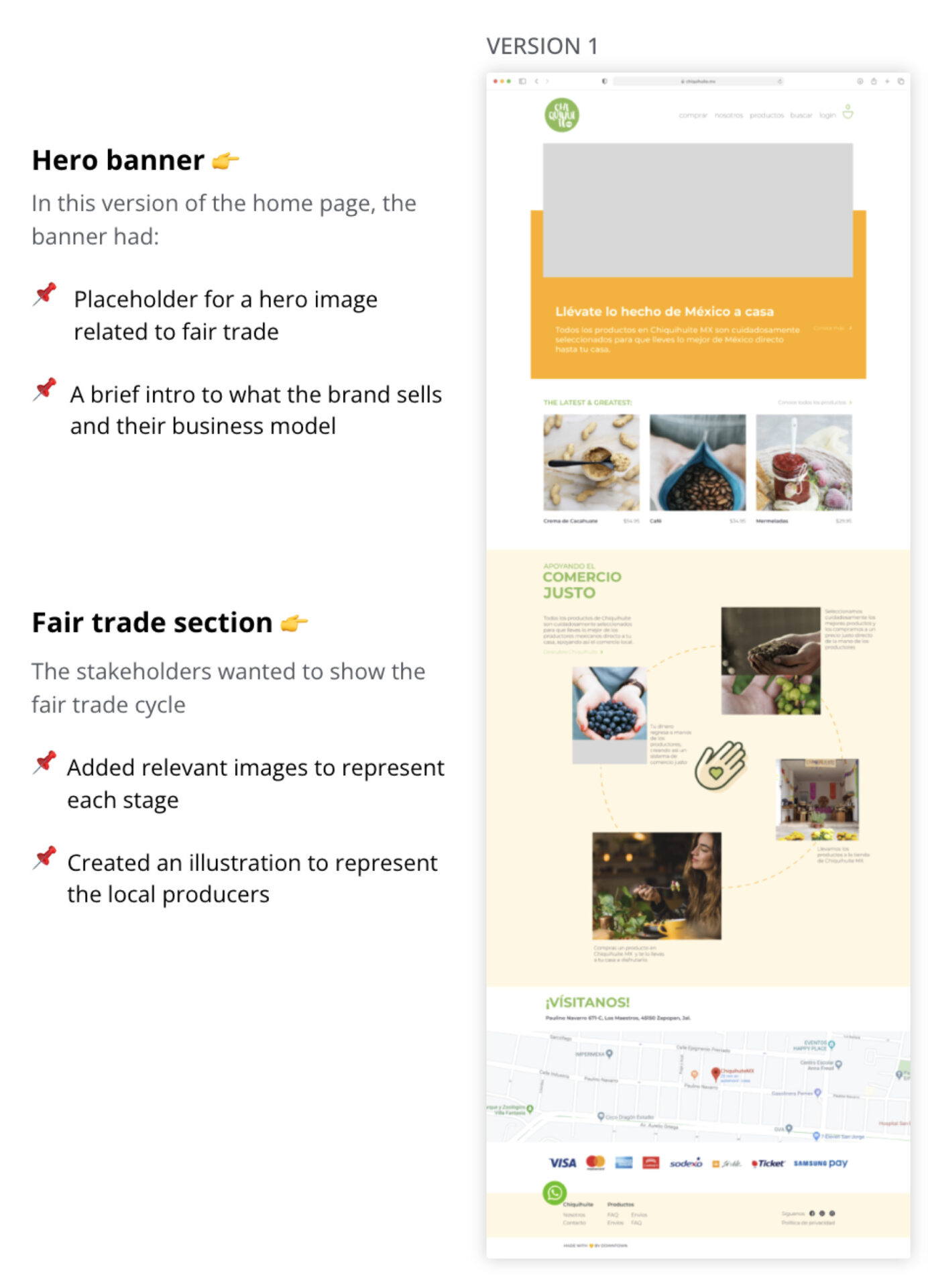
Home Page Design
- Placeholder for hero image
- Brief intro section to the brand and business model
- Relevant images to represent each stage
- Illustration to represent local producers


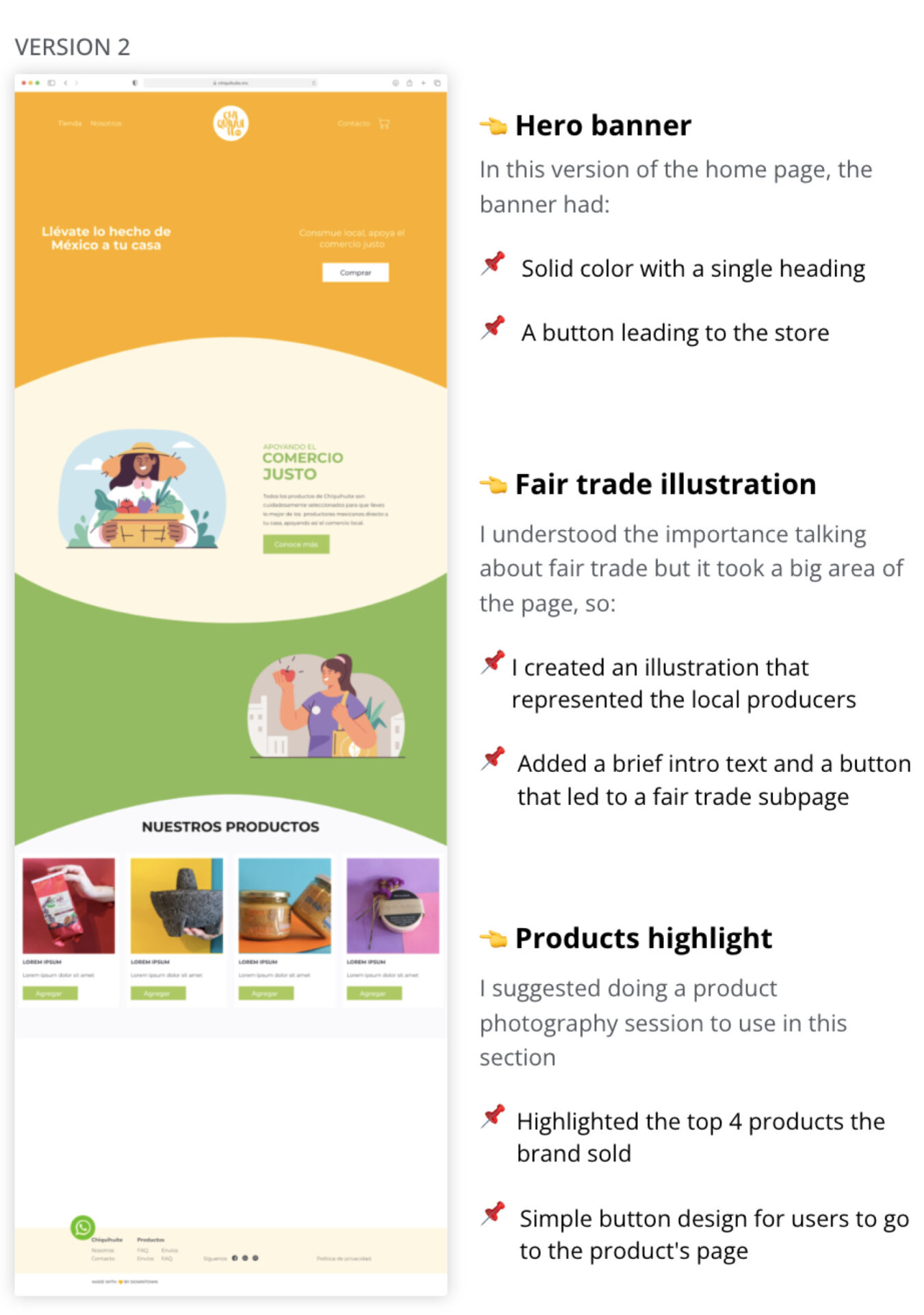
- Solid color with a big heading
- Clear button CTA to the store
- Illustration to represent the local producers
- Brief introduction about fair trade and a button to learn more
- Highlight the top 4 best-selling products
- Button to quick-add the product to the cart
Feedback from stakeholders
Finalizing design exploration to move to development
What I learned:
- The stakeholders preferred the design that included illustrations and only used photos for products
- Decided to move the product highlight section below the hero banner
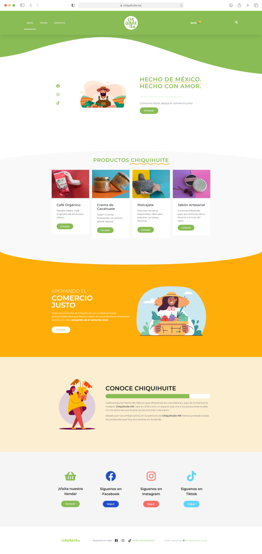
- Animated Lottie to represent local producers
- Highlight all products are “Made in Mexico”
- Button to access the store
- Top 4 best-selling products
- Product photo session to create great photos
- Quick-add buttons for each product
- Illustration to represent local producers
- Brief intro about fair trade
- Buttons to lead to the store page
Learn about the brand, who they are, and their goals

Design
Moving on to the other high-fidelity wireframes
To meet the project deadline, I recommended that stakeholders down-select the number of products featured on the website, ensuring we could successfully launch by the end of the fourth week.
What I did:
- Helped identify the top-selling products
- Started designing the store and product pages
Store Page Design
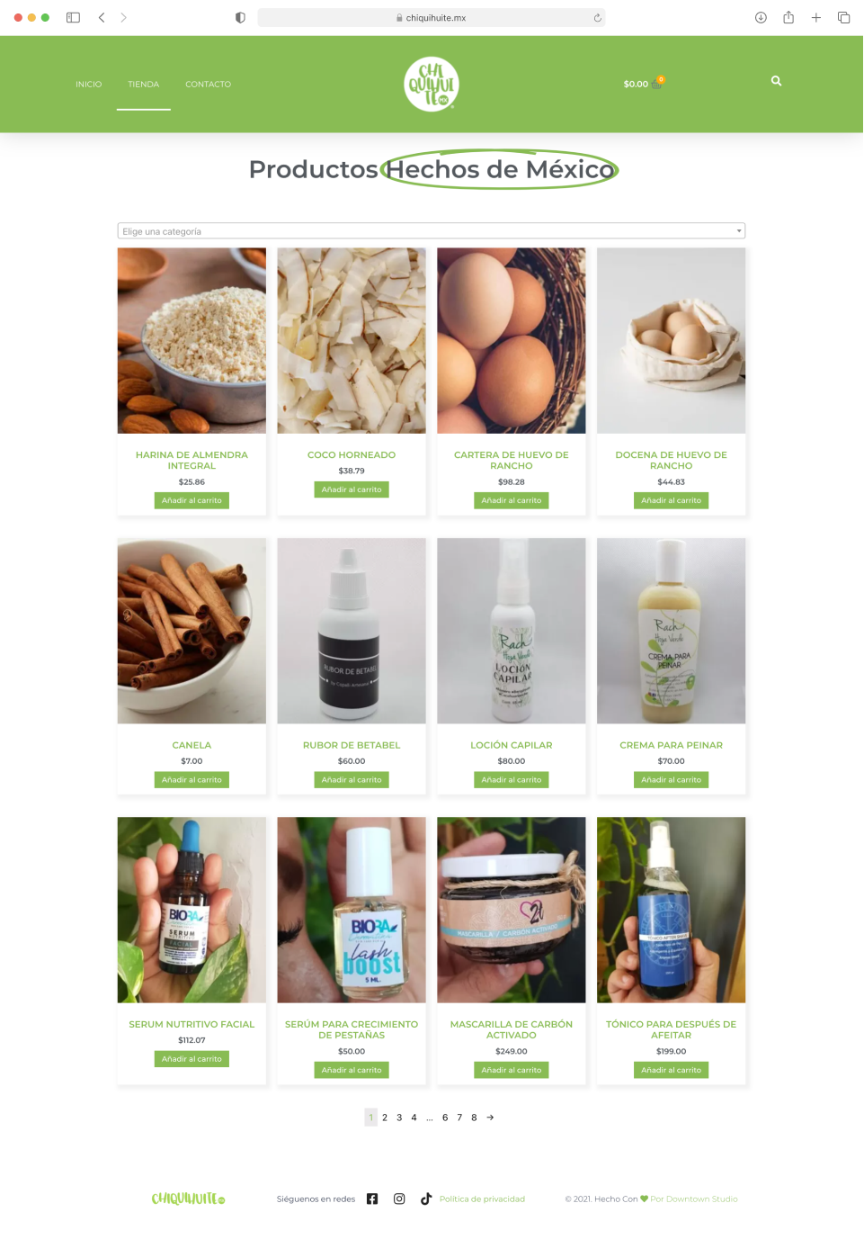
To meet the launch deadline, there was one design for the store page:
- A 3×4 grid to show 12 products per page to the user
- Dropdown category selection menu for users to navigate
Single Product Page Design
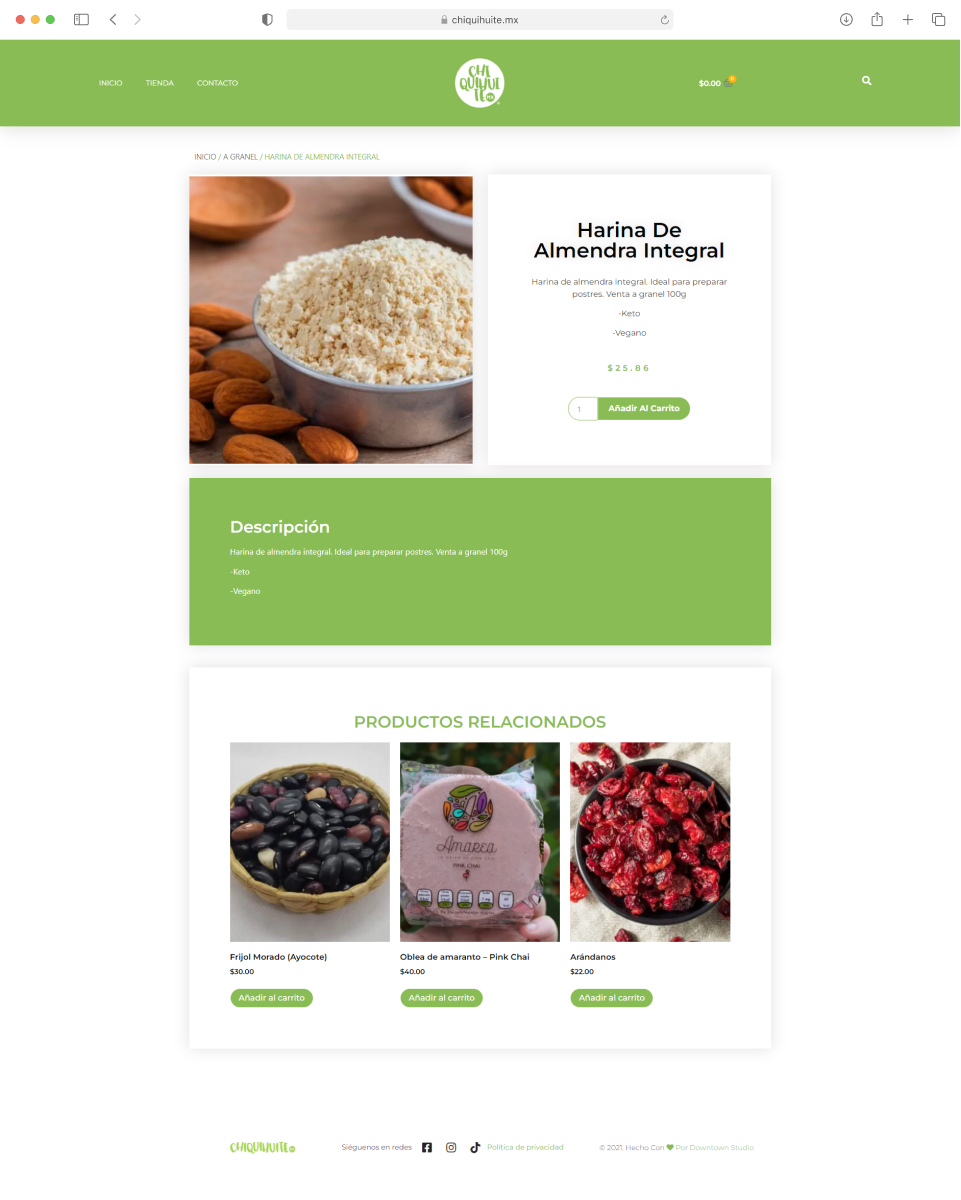
- Two column grid where the left side had the featured image of the product
- Product details are an entire color block below
Training Stakeholders
Empowering users to manage their e-commerce platform
In preparation for the website launch, it was crucial to provide key stakeholders and staff with the necessary training to manage their online store effectively.
What I did:
- I conducted a quick training program for Chiquihuite MX’s staff members, teaching them how to efficiently manage their online store using the WooCommerce platform
- I offered ongoing support to the stakeholders to ensure they were comfortable using the WooCommerce platform even after the website launch
Results
Maintaining business continuity, launching a digital presence, and training stakeholders
- Successfully launched a new e-commerce website for Chiquihuite MX
- Streamlined the product selection process to feature a curated selection of items
- Ensure smooth operation and business continuity by training key stakeholders on how to use WordPress and WooCommerce to manage their online store