Branding in the forster care space
KEPT: Kits for Engaging Parents and Teenagers. KEPT is a system of shared activities and collaborative scrapbook kits for foster parents and teenagers to document their experiences together.
Client
Academic Project
My role
Visual designer
Team
Director of Sales
Developer
Tools
Illustrator
After Effects
Year
2023
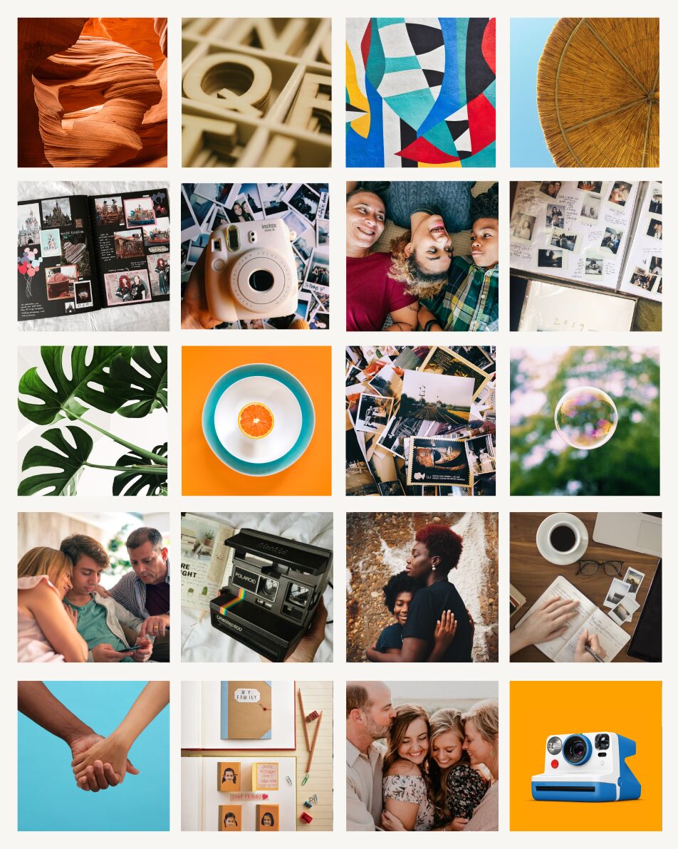
Moodboards
Rooted in the brand’s design principles
Bring out the best (in) people
KEPT should gently remind foster parents and those involved in foster care why they chose to participate in the care system.
Encourage, not enforce
KEPT should be a starting point for a stable, trusting relationship to develop organically.

Adapt to the individual
KEPT must acknowledge that the teenagers and families we seek to serve each have their own unique needs and experiences.
Build connections
KEPT should help set the foundations from which healthy, enduring connections can be created between the foster parents and the teenager.
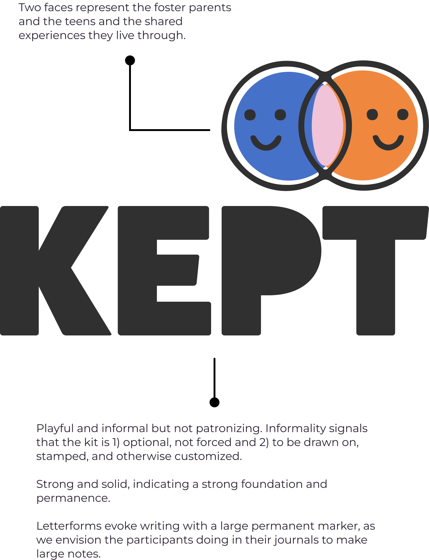
Primary logo Components

Variations
Brandmark

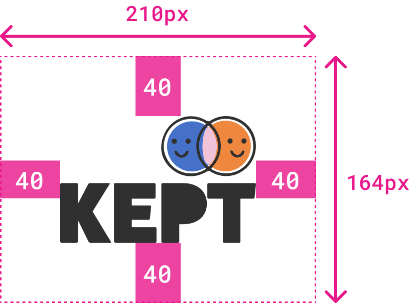
Safety area and dimensions

Incorrect applications
How not to use the logo


Logo animation
Bringing it to life
Brand Colors

Adhere to at least WCAG 2.1 AA standards. Contrast ratio (CR) must be > 4.5:1 (> 3:1 for enlarged text). Opportunity area: comply with AAA (enhanced) level of WCAG 2.1 standard.
Typography
Two main types for the kit and materials

The Rubik typeface is the primary font family used across KEPT kits. It is a rounded, heavyweight sans-serif that conveys a sense of playfulness.
In the KEPT kit, Rubik is used in our logo and the prompt cards. It is meant to make the kit more inviting to the teen without coming off as childish.

The Lora typeface balances Rubik’s solid yet playful character. It is a well-balanced, contemporary serif with roots in calligraphy.
Its moderate contrast makes it suitable for body text. In the KEPT kit, Lora is featured in our instructions and additional resources for parents.