SaaS RPA Translation tool dashboard
JOLT was a Robotic Process Automation (RPA) startup consultancy focusing on helping enterprise clients jump-start their RPA initiatives with UiPath, Automation Anywhere, and Power Automate.
Leadership identified an opportunity to create a no-code web application for clients to streamline the transition from legacy automation platforms -like Automation Anywhere- to a more robust and scalable platform like UiPath.
Client
JOLT Advantage Group
My role
Product designer
Team
Director of Sales
Developer
Tools
Figma
Illustrator
FigJam
Year
2020
TL;DR
What this case study is about
Business Objectives
- Be first to market
- Launch a no-code SaaS product for streamlining RPA platform transition projects
Constraints
- One-person design team
- Limited budget for development
- Shifting business priorities
My Role
- Product design
- Collaborating with the Director of Sales and a developer
Results
- Solid foundation for the look and feel of the SaaS
- Early stage high fidelity wireframes
- Product did not launch due to a shift in business priorities
Discovery
What is this product?
Key user flows
- Manage and track their automation code translation progress
- Visualize the amount of AA code that could be reused in UiPath
- Calculate the amount of extra development time needed
- Manage multiple projects within one screen
- Deep dive into a single file’s contents
- On-demand access to tech support
Understanding the product
Interviewing an SME
I interviewed the Director of Sales to better understand the core aspects of the 3 main dashboard screens, what tasks the users would perform, and what data would be visualized. I learned the following:
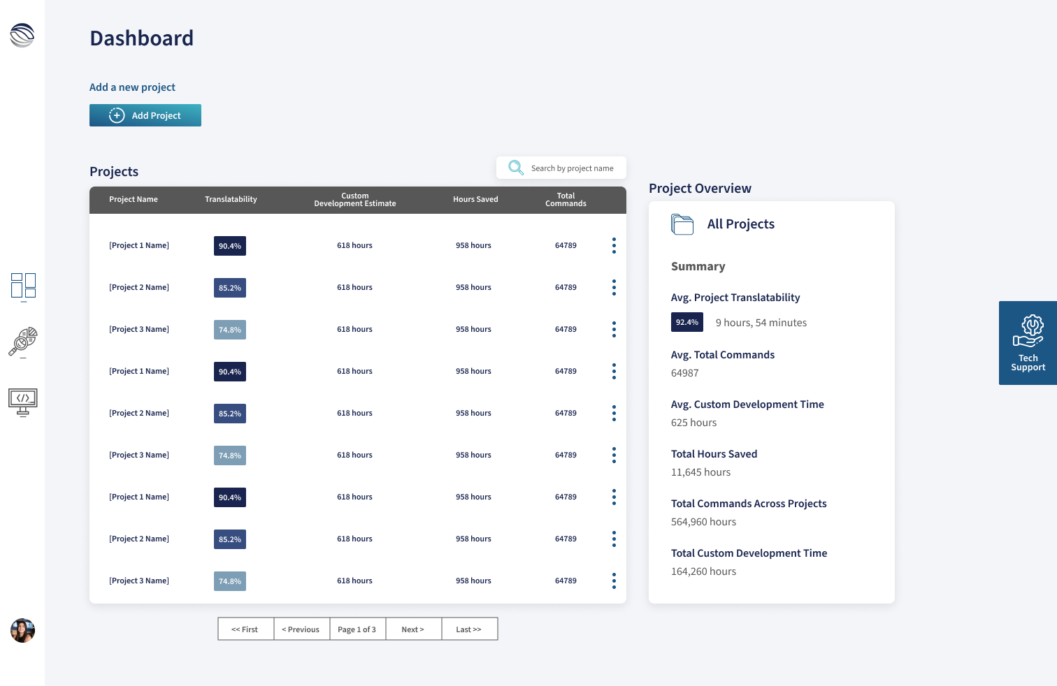
Project Dashboard
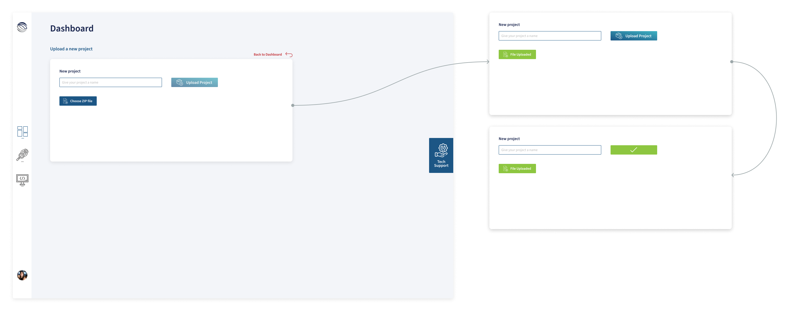
- Upload a new project
- Have an overview of all their projects in translation
- Search all their projects
- Delete one or more projects
- Get a summary of project statistics and data
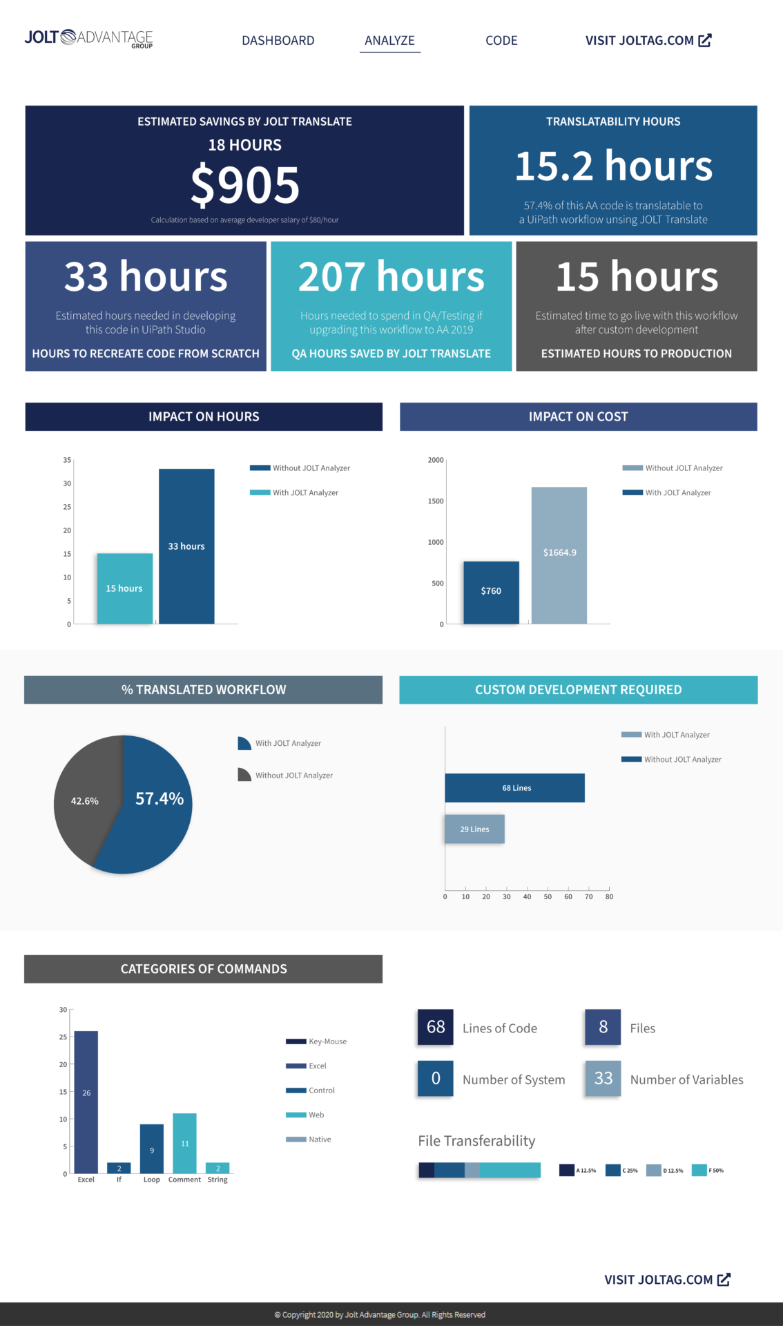
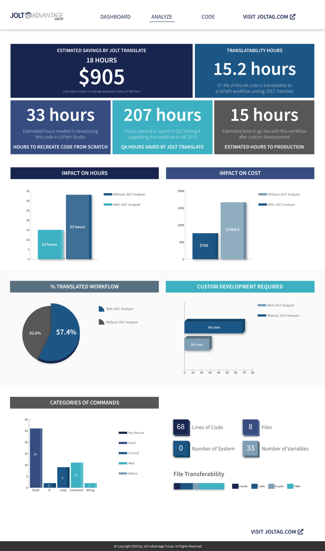
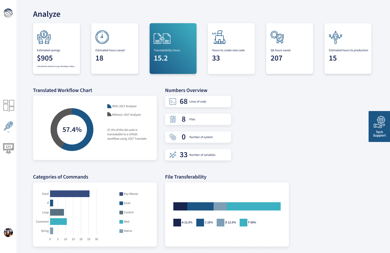
Analyze (Main Screen)
- Visualize 6 essential metrics for each project
- Understand what percentage of their code was translatable to UiPath
- Quantify the categories of commands included in their project
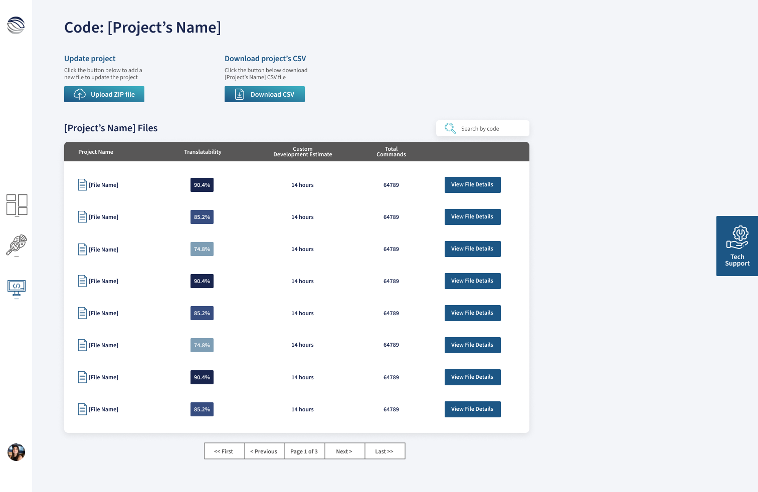
Code
- Dive deeper into each file contained within a project
- Understand the translatability, custom development time to translate, and the total commands included in each file
Ideation with Stakeholders
Early idea of the product layout
First reaction to this layout:
- Text-heavy components
- All elements were tightly clustered together
- No clear distinction between each section

Early design
Jumped into high-fidelity from the get-go
What I learned:
- Cluster of metrics components at the top remained text-heavy
- Lack of icons to relate to key concepts hindered the readability of the UI
Collaborating with Leadership
Discussing design with project champion
Design meeting with leadership:
- Leadership wanted to add 3D elements to the UI
- Same layout was still being pushed by stakeholders
Getting buy-in from leadership
My manager helped get support to explore new layouts and designs
Got buy-in to:
- New visual exploration
- Iterate more on the design on different screens
- Research SaaS dashboard design trends
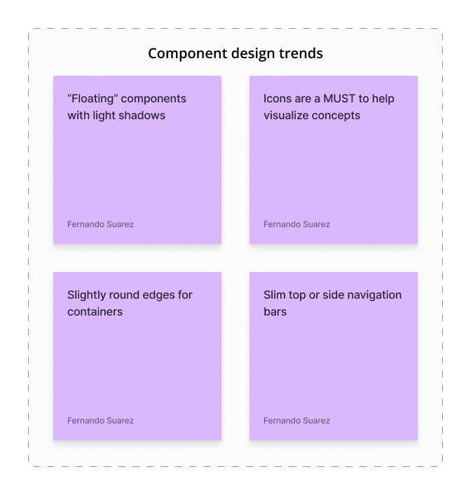
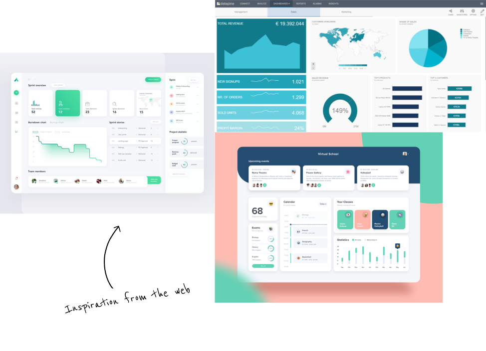
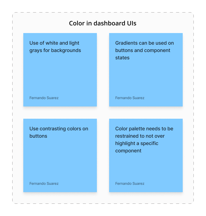
Visual inspiration
Main Analyze screen
Setting the foundation for the product's look and feel
Key aspects of the new design:
- Persistent left sidebar menu to navigate between the three main screens
- Sections and components differentiated
- Incorporated the brand’s colors to the components
Project dashboard screen
Diving into user flows
Key aspects of this screen:
- Overview of all the user’s projects in translation
- Ability to upload a new project
- Search bar component to filter through projects
Code dashboard screen
Streamlining file exploration for users
Key aspects of this screen:
- All files within a project
- Percentage of translatability
- Button to see the relevant file details
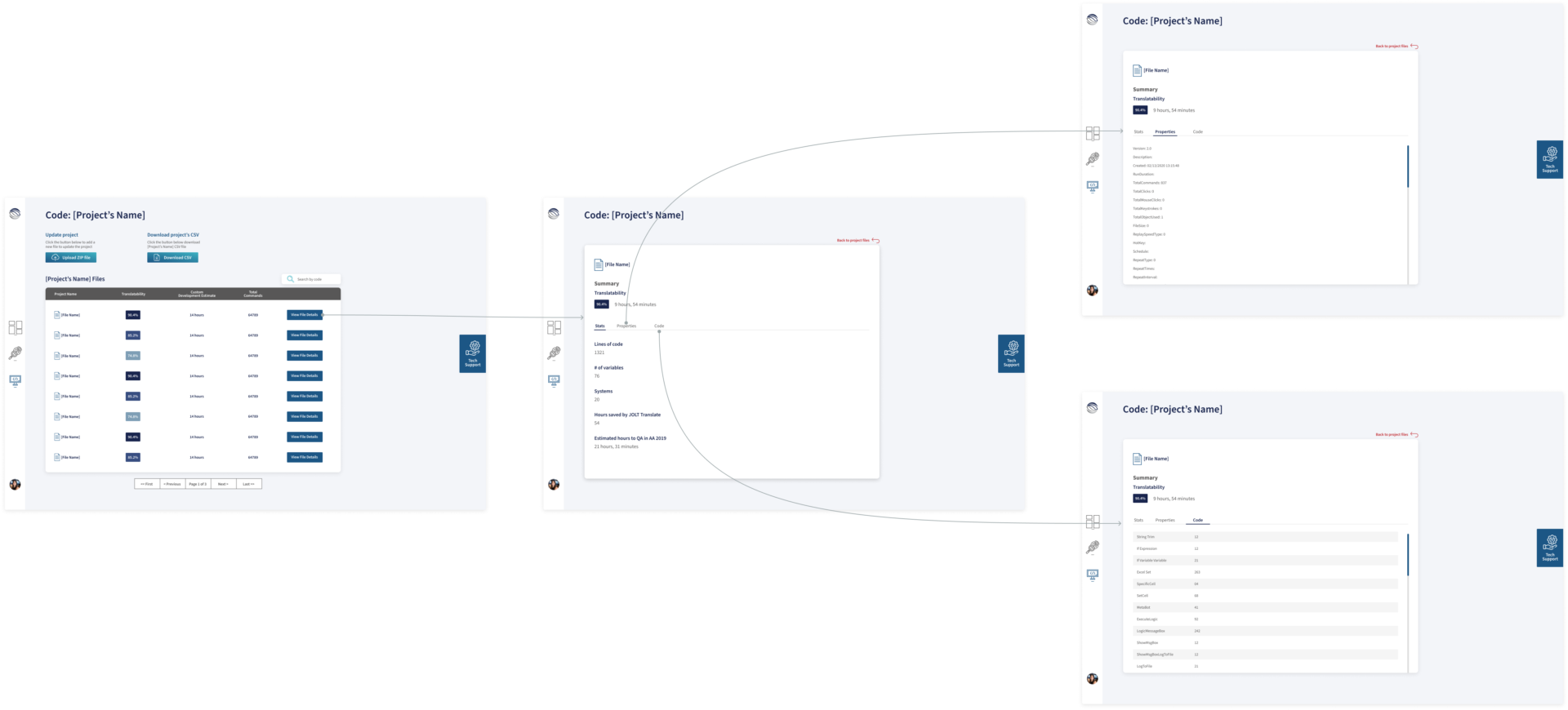
I created the user flow when navigating a file’s details. This screen had 3 sub-screens: Overview stats of the file, properties of the file, and code deep dive.
Shifting business priorities
The company was being acquired by Roboyo GmbH
- JOLT started negotiations with Roboyo – a German intelligent automation consultancy – to be acquired
- The SaaS project was shutting down because Roboyo wasn’t interested in developing it