Telehealth Appointment Booking Refresh
Zócalo Health is a virtual family medicine service specializing in culturally aligned care for the Latino community. It is on a mission to eliminate barriers to healthcare access by offering same-day or next-day appointments and emphasizing long-lasting relationships over one-time transactions.
I collaborated with Zócalo Health to explore and better understand the reasons behind user drop-off during the appointment booking process and uncover why some users who booked appointments did not attend them.
My goal was to help conduct discovery research and design a future vision for what the onboarding and booking experience could become.
Client
Zócalo Health
My role
UX designer
Team
COO
UX Researchers
Tools
Figma
After Effects
FigJam
Otter.ai
Year
2023
My impact
I led the design efforts to reimagine the appointment booking experience within the Zócalo Health journey. I collaborated with UX Researchers to better understand users’ needs and uncover low-effort opportunities for improving the experience.
My contributions culminated in creating mobile-first prototypes that represented a future-state vision, which I presented to Zócalo Health’s leadership for inspiration and consideration.
TL;DR
What this case study is about
Business Objectives
- Understand and reduce friction in the appointment booking process
- Establish a north-star design vision for booking an appointment
Constraints
- Navigating healthcare conversations and trauma when talking to users
- Limited budget for recruiting participants
- Existing brand and visual style
My Role
- UX design
- Collaborating with the UXR team
- Creating prototypes in Figma
- Facilitating usability testing
Results
- Testing showed smoother booking, likely reducing drop-offs
- New emails helped patients attend appointments
Discovery
Understanding the Customer Journey
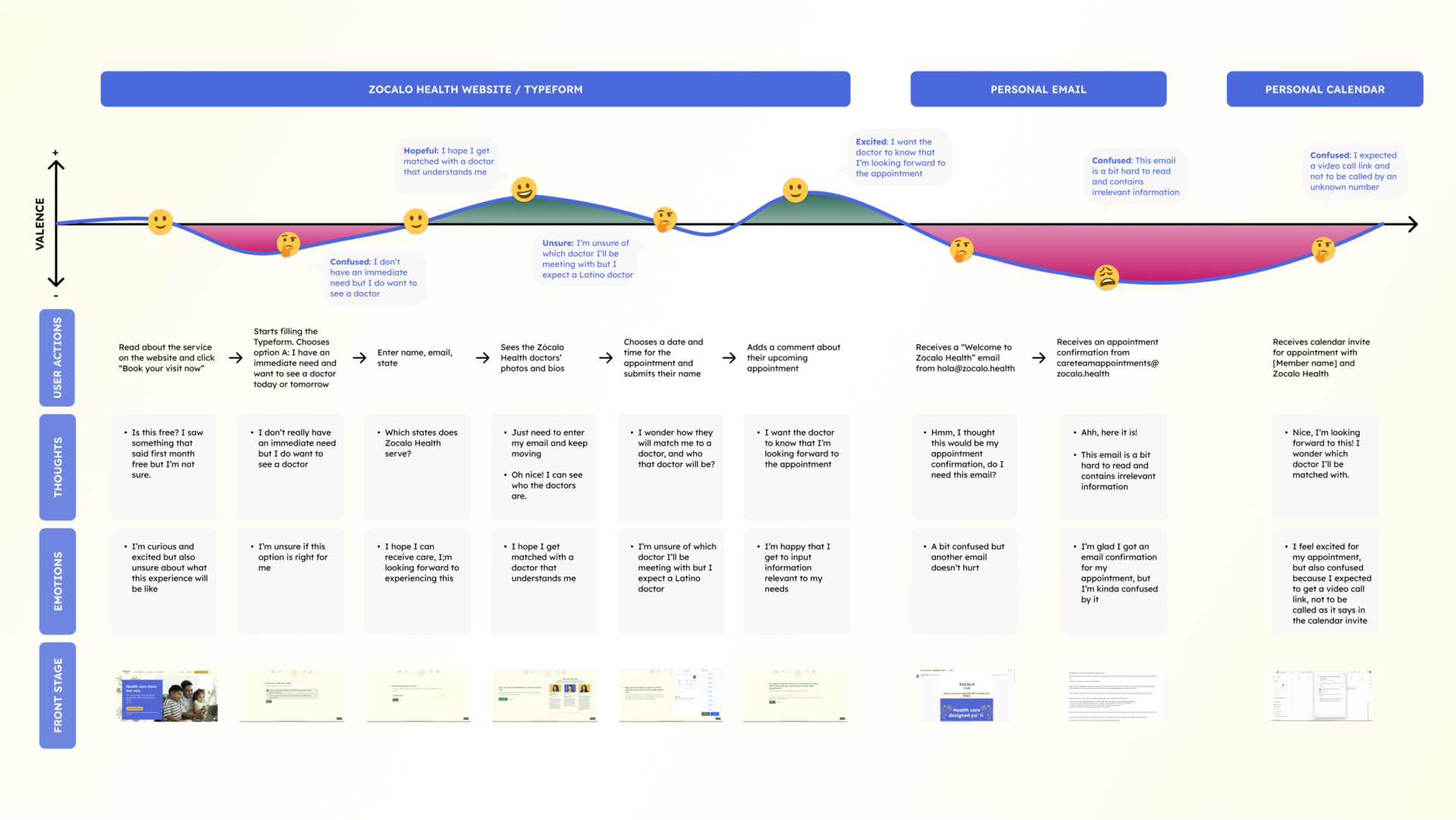
Pain Points
What we found out
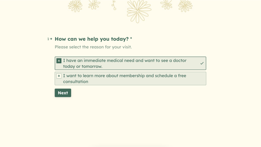
Users wanted to see a doctor as soon as possible. The first step of the Zócalo Health journey was adding friction because it was already cross-selling another offering, prompting users to drop off.
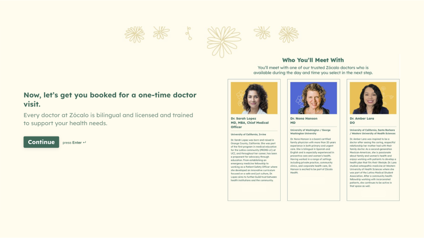
Patients expected to be able to choose their doctor and learn a bit about them before deciding, but the “doctor” screen didn’t allow users to select a doctor.
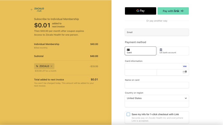
Drop-off occurred during checkout because some users thought there were hidden fees or the appointment description was unclear.
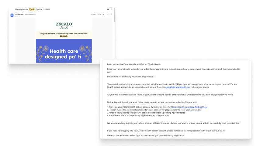
The overwhelming and confusing email design made it challenging to understand how to prepare for or attend a doctor’s appointment, resulting in many no-shows.
Process
User Persona
Based on the information from the interviews, we identified the Latina Millennial as our main user persona — tech-savvy, often mobile-first, and deeply values warmth and trust in healthcare.
Latina Millennial
“The whole healthcare system is still something that I don’t quite have a good grasp on how it works. It’s still very unknown to me, even though I’ve had to help my parents and siblings, it’s still something I feel intimidated by…”
Goals
- Receive healthcare services from a trusted provider
- Establish a close relationship with her care providers, being able to revisit them
- Help parents navigate the healthcare system through translation and communication
Barriers
- Doesn’t fully understand the US healthcare system herself
- Tries to access a healthcare system that doesn’t provide culturally competent care
- Long waiting times every time she tries to schedule an appointment and once she is there
Needs
- For the doctor to ask questions about her life beyond her symptoms.
- For her doctor to speak the same language as her in order to avoid translating.
- Feel heard during the consultation and avoid feeling rushed.
- Feeling comfortable and able to ask questions to the doctor.
Tasks
- Read documentation related to healthcare services
- Find recommendations about trusted providers
- Make calls to gather information and schedule appointments
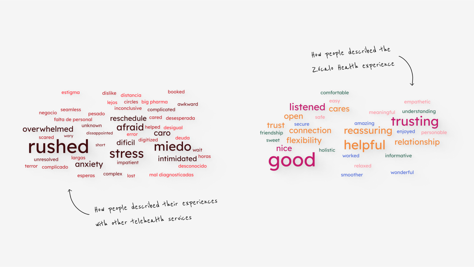
Word Clouds
How our users feel about telehealth services
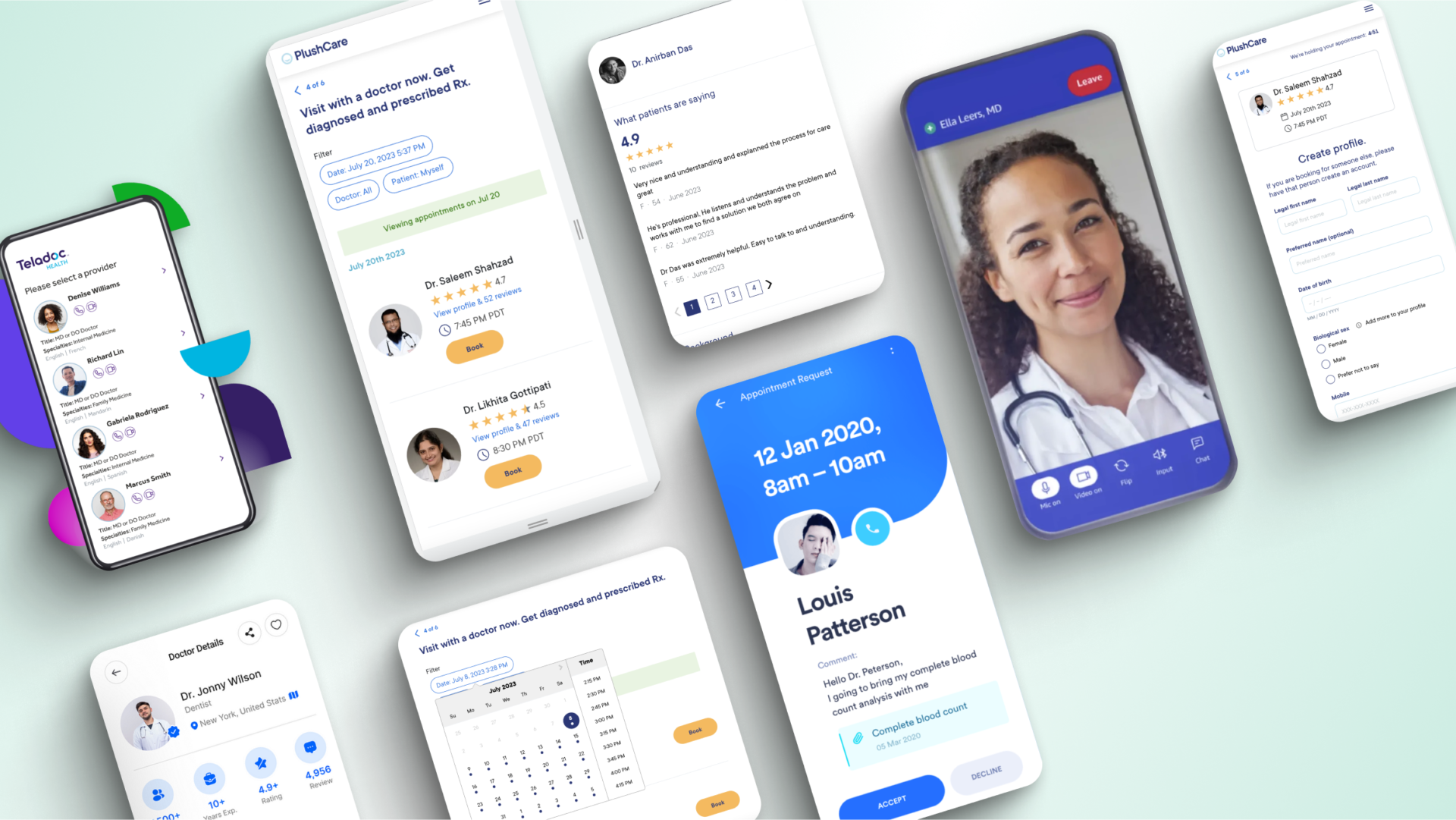
Visual Inspiration
Looking at what users like from other telehealth platforms
Exploring a solution
Mid-fi wireframe design
Usability testing
Rapid testing to evaluate the first design round
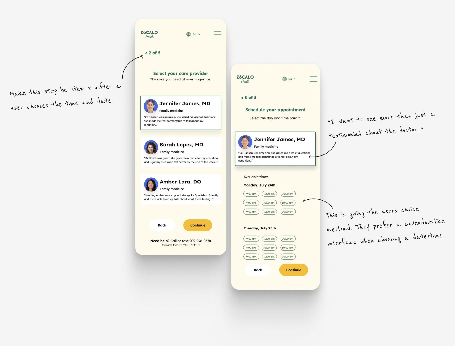
I tested this early concept with people familiar with telehealth (but not Zócalo Health) to gather feedback on my proposed vision. Key takeaways were:
- Users expected to interact with a calendar to select dates.
- Participants wanted to see more than just a testimonial when choosing a doctor.
- People preferred to choose date/time before selecting a doctor, to see who was available.
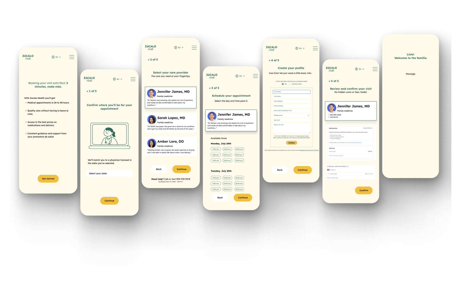
North Star
A new user flow, features, and email design to improve the appointment booking experience
My future-state design vision addresses core pain points:
- Users can now view doctor bios and make a selection.
- Cross-selling is removed from the flow.
- Clear explanations are provided about what’s included.
- Emails after booking are redesigned to be clear, supportive, and mobile-friendly.
- The familiar “Spanglish” tone is used across touchpoints to feel culturally aligned.
User Flow
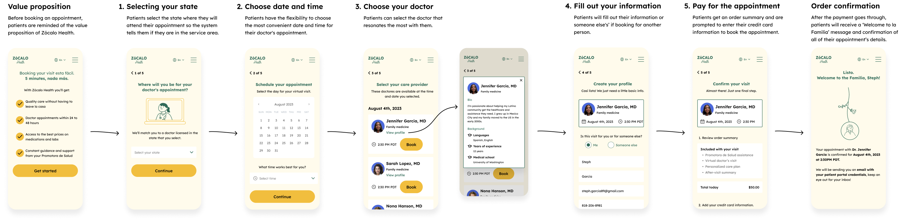
To help users book a doctor’s appointment as quickly as possible, to streamline the experience, the new appointment booking flow includes just five key steps:
- Select your state
- Select the date and time
- Choose your doctor
- Fill out your information
- Pay for the appointment
New feature
Engaging with patients outside Zócalo Health’s service area
Currently, Zócalo Health doesn’t offer healthcare services in all US states. Therefore, it was essential to try to retain potential patients outside the service area.
To do this, I added a feature that when a user selects a state where Zócalo Health isn’t present, they would be made aware that Zócalo Health would like to let them know when they are available and request their email.
Choosing your Doctor
Interviews shed light on people’s desire to choose and to know more about their doctors. What do they specialize in? Do they speak Spanish? How many years of experience do they have? Are there any reviews or testimonials?
I addressed these questions using a component that could display the information when the users tapped it.
Micro-animation Welcome
To reflect Latino culture’s warmth and relational nature, I designed a welcome animation and celebratory message for users who complete their booking.
New Email Design
To address the no-shows due to email confusion, I designed new emails that only included the relevant appointment information, had a clear hierarchy in the instructions, and added a button for a one-click action to get to the patient portal.
I also highlighted Zócalo Health’s openness to provide any support to get to your appointment.
Usability Testing #2
A step in the right direction, but it can still be refined
With the help of Zocalo’s research team, I helped conduct usability tests to better understand how the new appointment booking experience felt and what could be improved and iterated upon. The following was uncovered during this test:
- The first screen with the value proposition felt like an extra click if you were coming from the website’s home page.
- There is a preference for seeing “patient stories” rather than a traditional 5-star score rating for the doctors.
The new appointment booking experience prototype was handed off to Zócalo Health’s leadership to implement and integrate into their development cycle.
Recommendations
- Apply feedback from the latest usability testing session
- A/B/n test email designs to uncover potential improvements to copy, hierarchy, and structure
- Add better localization features for Spanish-speaking users
Conclusion
Designing for a community I’m part of and for such a vital need was incredibly meaningful. This project allowed me to expand my UX practice into areas of vision-setting, information architecture, usability testing, and micro-interaction design. Most importantly, it reinforced that in healthcare, good UX means meeting and exceeding expectations at every step.